
Client: Kara Hunter Photography
Role: Brand Designer
Year: 2025
Overview:
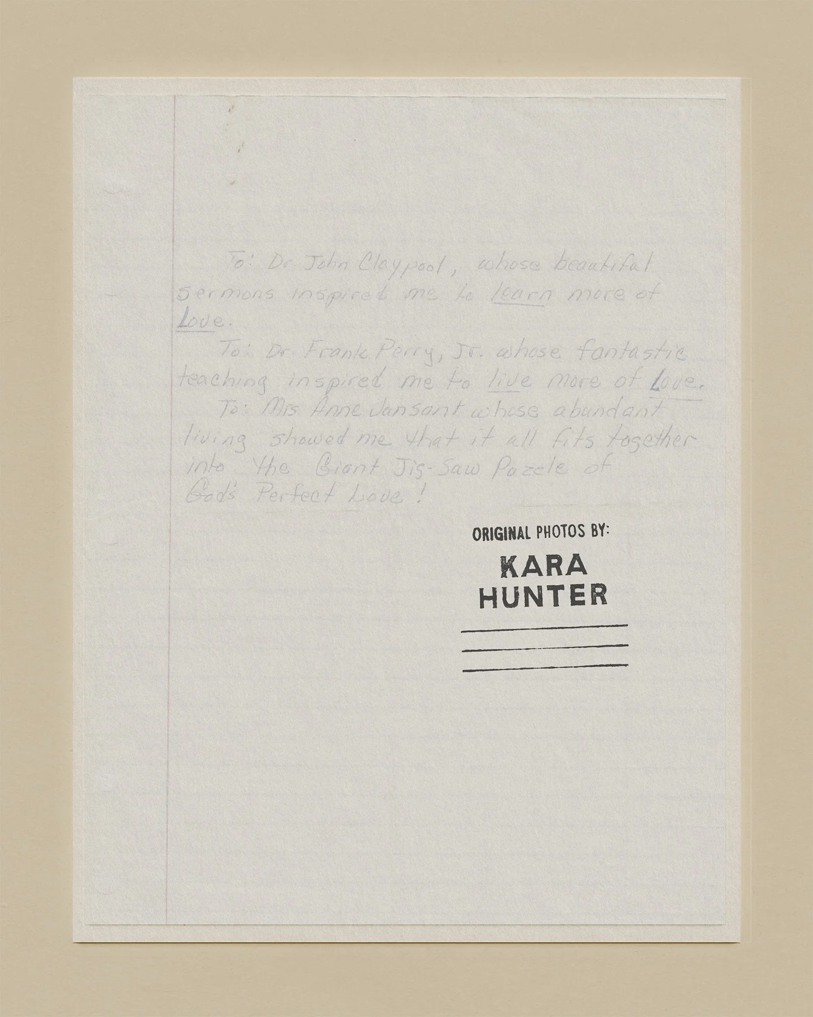
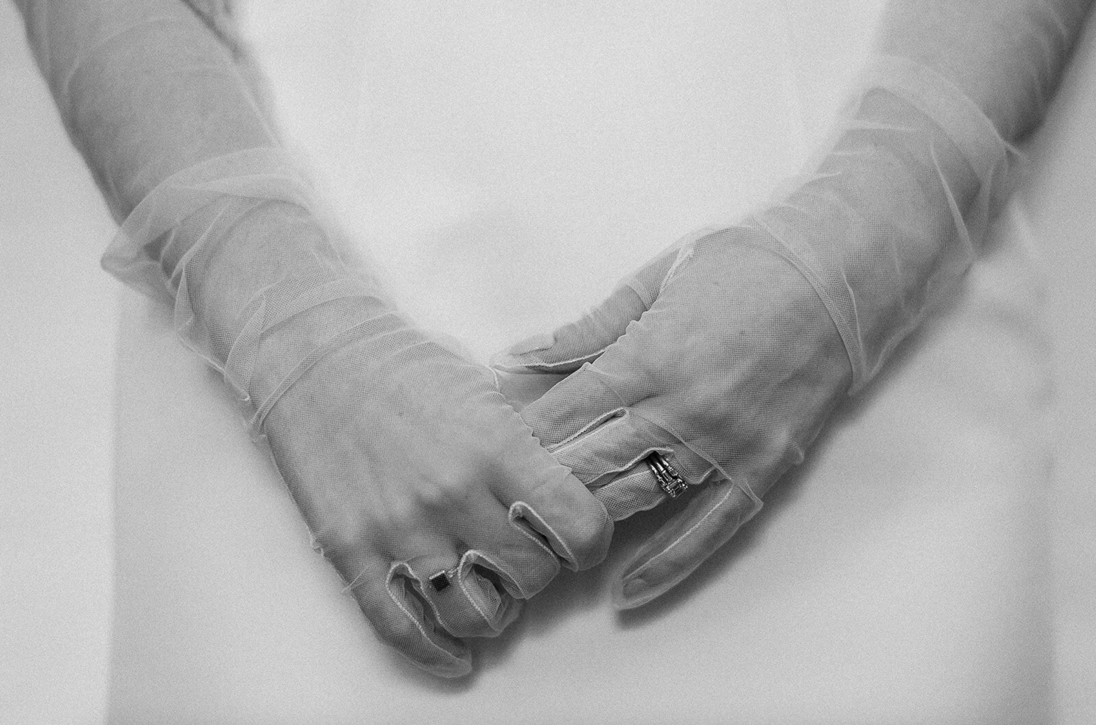
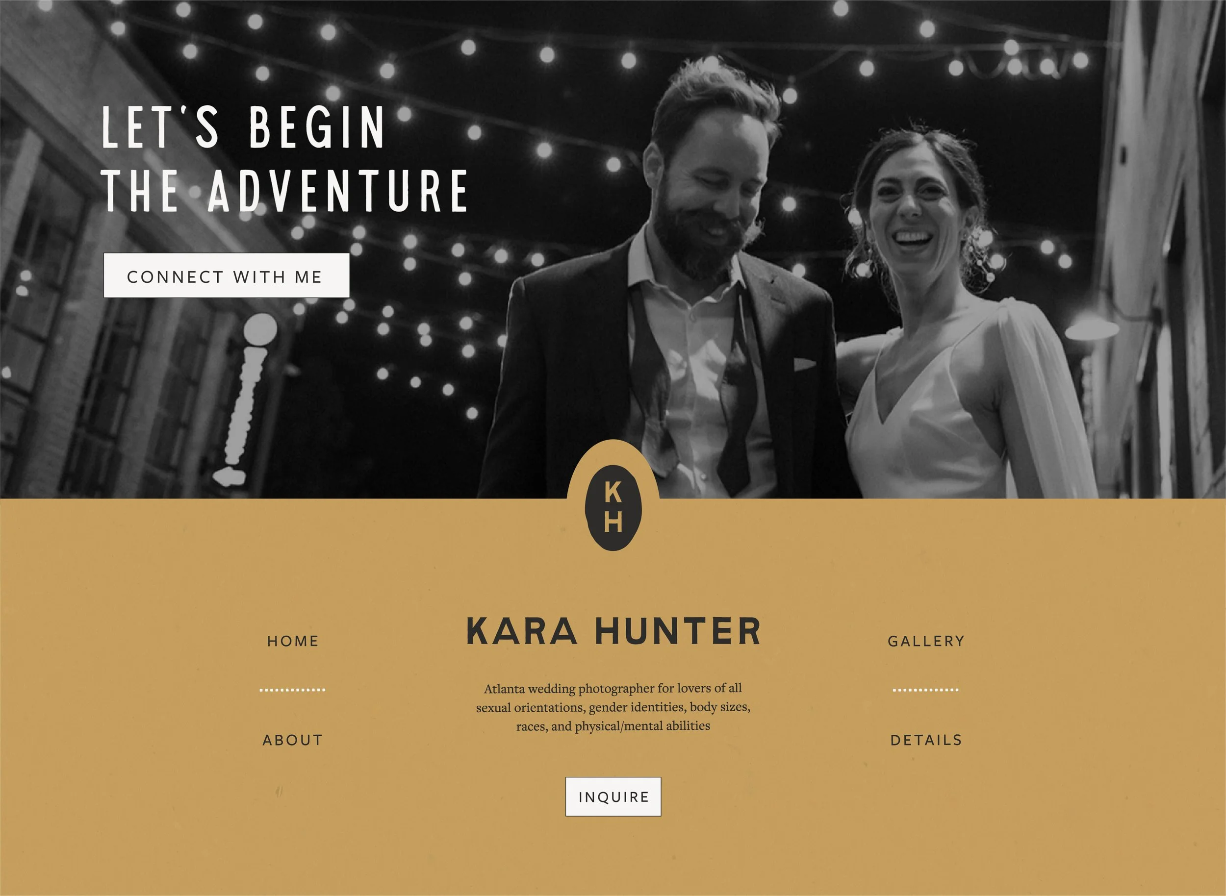
Kara Hunter Photography is an Atlanta-based photography studio that captures love and connection in its most raw, honest, and intentional form. Serving a beautifully diverse clientele, Kara approaches her work with the belief that everyone deserves to feel seen and celebrated. The brand identity needed to reflect her deep values around inclusion, representation, and emotional authenticity without pulling focus from her photography itself. A key influence in shaping the tone of the brand came from Kara’s own family: her grandparents’ enduring love story, which deeply inspired her purpose as a photographer and her drive to help others preserve meaningful memories through visual storytelling.
The Challenge:
Create a grounded, professional brand identity that reflects Kara’s inclusive, documentary-style photography without overshadowing the imagery itself.
Avoid an overly editorial or cold aesthetic. Kara’s brand needed to feel human, honest, and emotionally resonant.
Build a flexible design system that could be used seamlessly across digital and print applications, including website headers, client guides, and watermarks.
Ensure the identity reinforces her mission to serve all kinds of love and individuals with respect and care.
The Solution:
Storytelling-Driven Identity Rooted in Memory
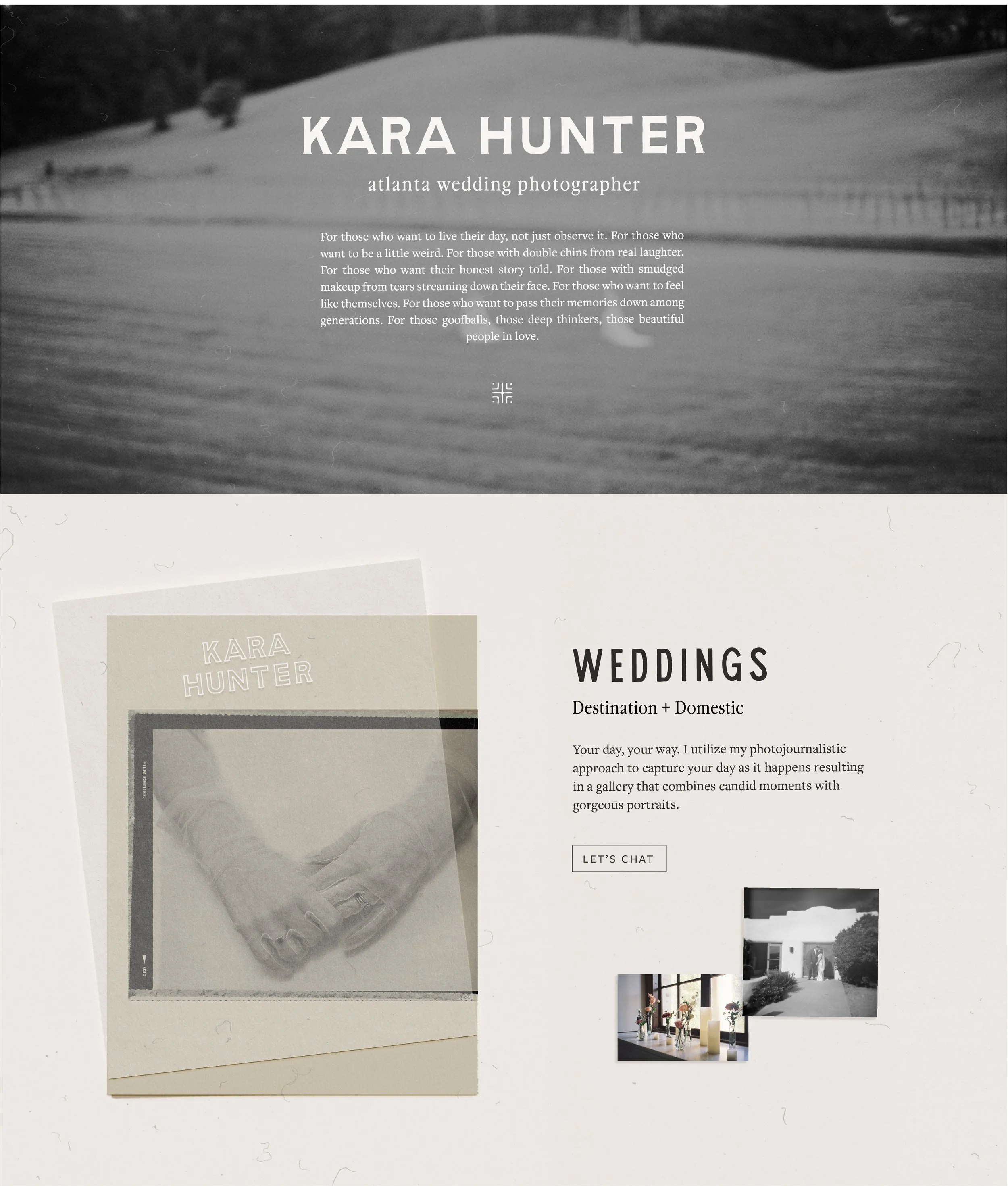
Inspired by Kara’s connection to her grandparents’ relationship and her mission to document love with depth, we created a brand identity that’s both timeless and intentional. The typography leans classic, while custom touches keep it personal and human.
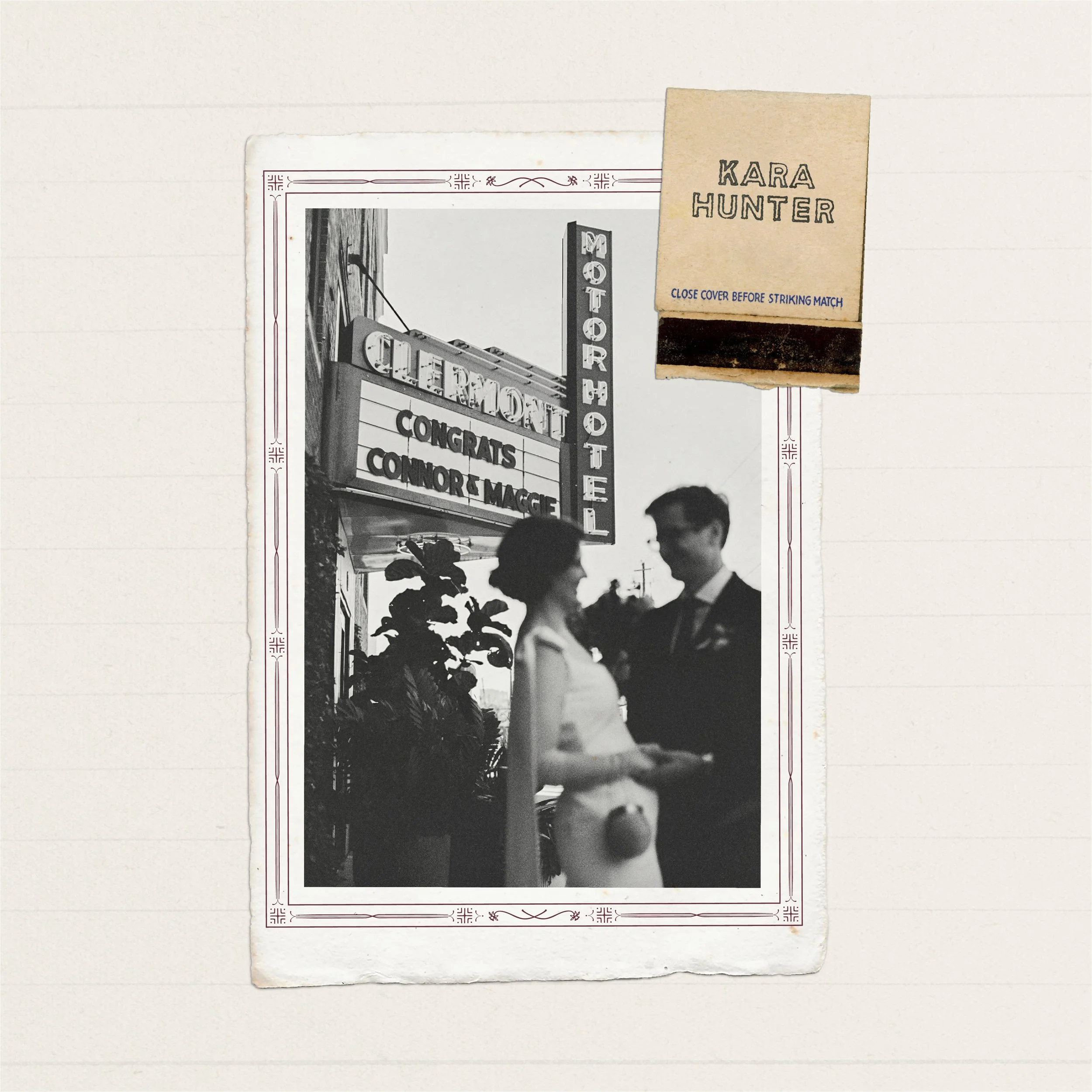
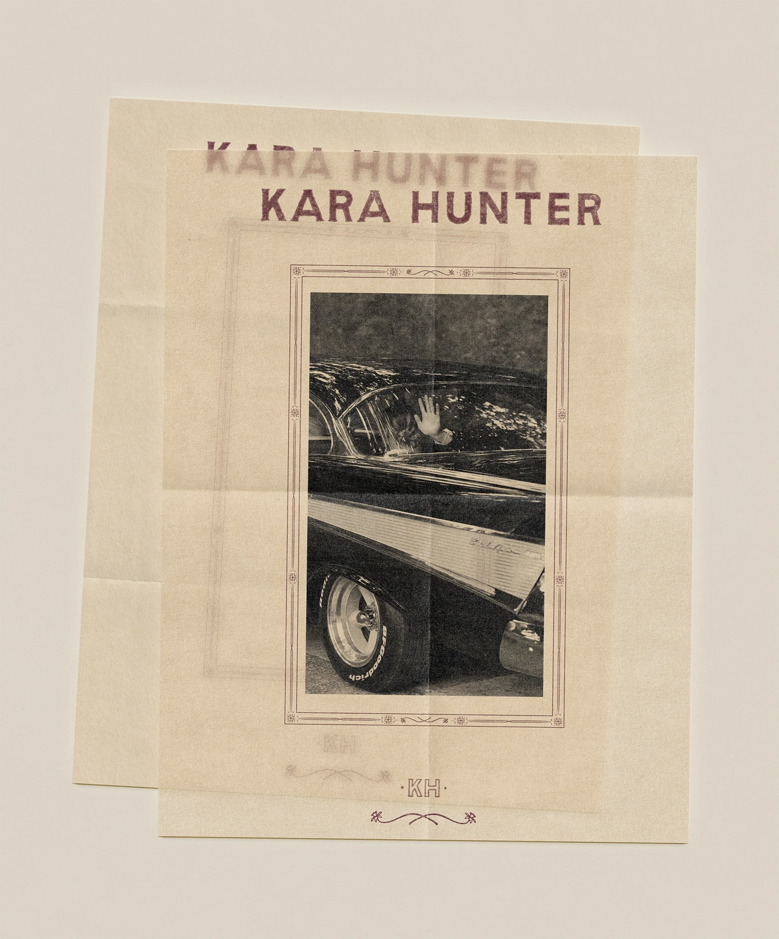
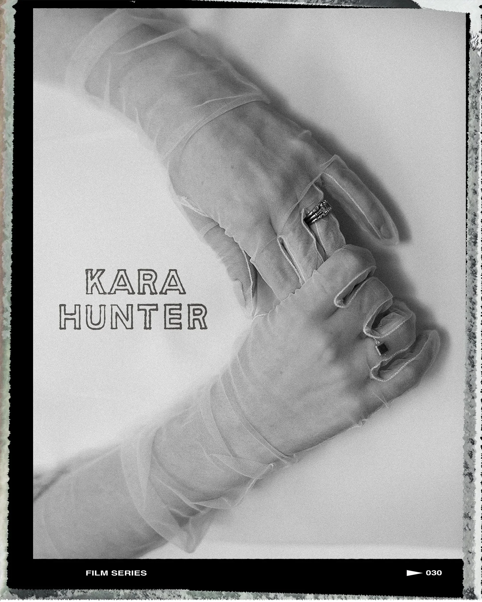
Hand-Drawn Frames Inspired by Family Archives
We developed a series of hand-drawn photo frames that nod to Kara’s old family photo albums: subtle, nostalgic details that help frame her work (literally and figuratively) with warmth and intention.
Vintage-Inspired Color System
The muted color palette was pulled directly from the faded hues of vintage Kodak film development envelopes and photo packaging from drugstore photo labs. These tones helped infuse the identity with a quiet sense of nostalgia that aligns with her memory-preserving ethos.
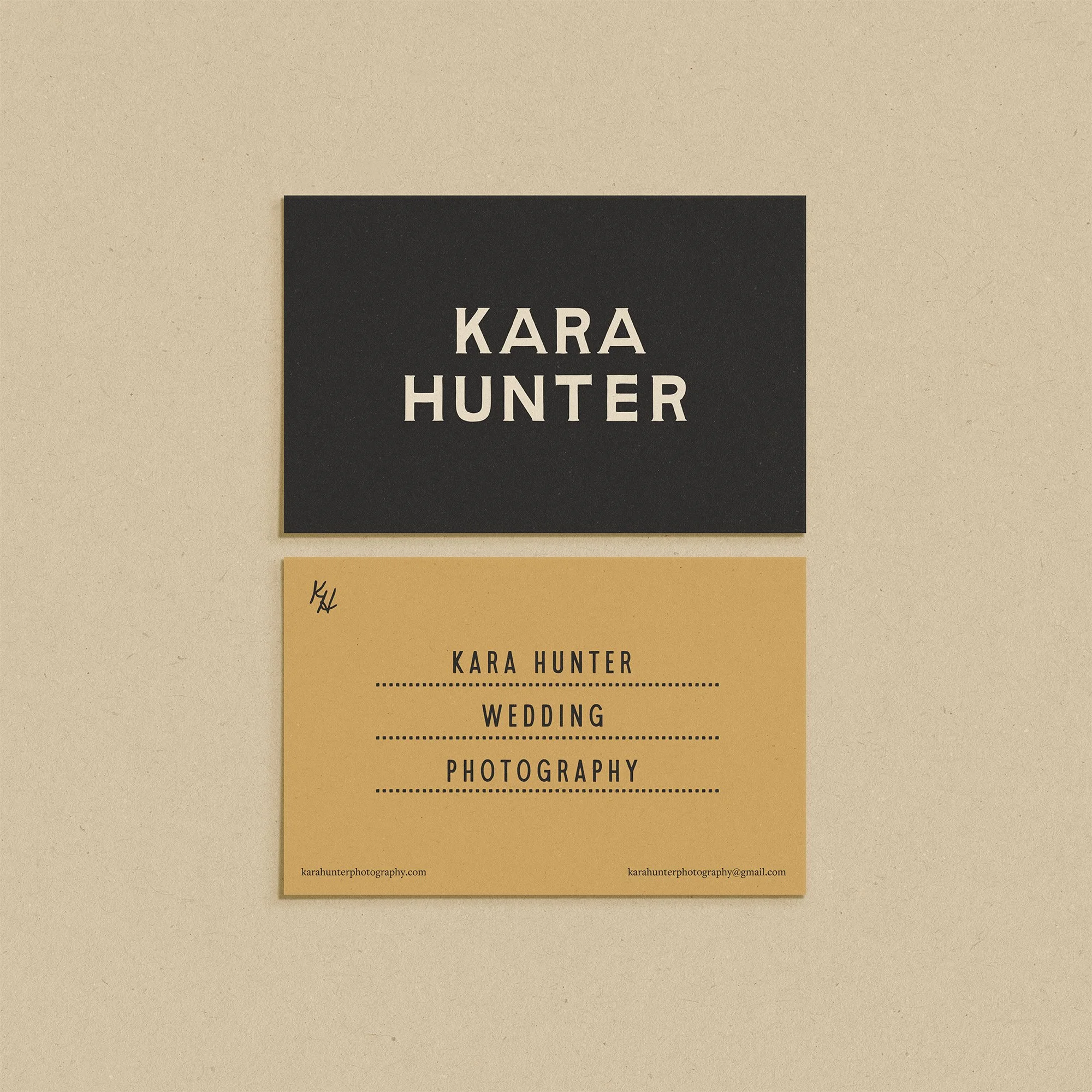
Flexible Logo System
We created a modular logo suite to give Kara range across applications like physical client photo albums, watermarks, packaging, and online use.